Woo Toys
Responsive Website
for Sustainable wood toys

-
WooToys is a website dedicated to sustainable, eco-friendly wooden toys for all ages.
-
It offers a curated selection of safe and ethically sourced products that inspire creativity and learning through play.
-
The user-friendly interface allows visitors to easily browse by category, age, or price, ensuring a seamless shopping experience.
This high-fidelity mockup illustrates the user flow, interface design, and interactive elements of WooToys, crafted for a seamless and engaging experience. See the complete prototype below.

PROJECT OVERVIEW
Duration Team Role Tools
2 months Group of three UX/UI and Graphic Designer Figma, Miro, Photoshop, Illustrator
Problem Statement:
-
Need: Growing demand for sustainable, eco-friendly wooden toys that inspire creativity and learning for all ages.
-
Current Gap: Existing websites in this niche suffer from poor navigation, cluttered designs, and lack of focus on sustainability.
Goals:
-
Design a simple, user-friendly website with easy navigation.
-
Highlight the eco-friendly and ethical sourcing of the products.
-
Ensure the website is inclusive for all age groups and responsive across devices.
Key Challenges & Solutions:
Age Inclusivity
Product categories for all age groups without limitation
Communicating Sustainability
Prominent eco-friendly labels and product descriptions
Mobile Responsiveness
Mobile-first design to ensure smooth performance on all devices
The Process

Discover
Define
Develop
Deliver
Discover
Our Discover process includes three key steps:
-
Heuristic Evaluation: Identifying usability issues using established principles.
-
Surveys & Interviews: Gathering user insights on needs and pain points.
-
Competitive Analysis & SWOT: Analyzing competitors to identify market gaps, refine our strategy, and leverage strengths, weaknesses, opportunities, and threats for better positioning.
Heuristic Evaluation
To ensure a seamless user experience, I conducted a Heuristic Evaluation of the design using Nielsen’s 10 Usability Heuristics. Here are the key findings:
1. Visibility of System Status
The website provides clear feedback on user actions, such as hover effects and active states on buttons.
2. Match Between System and the Real World
The design uses familiar e-commerce patterns, making it intuitive for users.
3. User Control and Freedom
The navigation includes clear categories and filters for easy browsing.
4. Consistency and Standards
The website follows a consistent visual style, with uniform typography and buttons.
5. Flexibility and Efficiency of Use
The checkout process minimizes errors with clear input fields and validation messages. Payment options and navigation buttons streamline the purchasing flow.
6. Help and Documentation
The website includes an FAQ section in the footer, providing users with easy access to answers for common questions, enhancing support and usability.

1
6
5

3
3
4
2
4
Surveys & Interviews
To create a seamless and engaging experience, we gathered insights from both stakeholders and potential customers.
Key Stakeholder Insights
-
The name WooToys is a smart choice, reflecting both sustainability and playfulness.
-
Stakeholders highlighted eco-friendliness, ethics, quality, and a smooth experience.
-
Challenge: Broad and undefined expectations.
-
Solution: Structuring discussions into focused topics helped align business goals with user needs.
User Interviews & Surveys
-
We interviewed various age groups to understand their shopping behaviors.
-
Users valued intuitive navigation, clear product details, and visible sustainability credentials.
-
Challenge: Low engagement at first.
-
Solution: Refining survey questions and analyzing competitors helped gather broader insights.
By merging stakeholder vision with user feedback, WooToys became an inclusive, user-friendly, and sustainability-driven website for all ages.
Competitive Analysis Table
This competitive analysis table highlights key strengths and weaknesses of industry competitors, identifying opportunities that informed WooToys' strategic design decisions.

Opportunities for WooToys:
-
Implement strong filtering options to enhance the shopping experience.
-
Clearly highlight the eco-friendly mission throughout the website.
-
Focus on a clean, user-friendly design with smooth navigation and mobile responsiveness.
Gaps in Competitor Websites:
-
Most competitors lack advanced filtering options (age/price), making it harder to find suitable toys.
-
Many sites do not emphasize sustainability clearly, despite selling eco-friendly toys.
-
Navigation issues are common, with some sites being cluttered or difficult to browse.
Key Takeaways:
SWOT Analysis
SWOT
Weaknesses
-
New brand, low market awareness
-
No mobile application
-
Higher pricing due to ethical sourcing
Threats
-
Strong competition with bigger budgets
-
Supply chain risks for sustainable materials
-
Price sensitivity among consumers
-
Fast-changing e-commerce trends
Strengths
-
Focus on sustainability & sourcing ethics
-
User-friendly navigation & filtering options
-
Mobile-responsive design
-
Curated high-quality wooden toys
Opportunities
-
Rising demand for eco-friendly toys
-
Weak UX/UI in competitor websites
-
Growth in sustainable play-based learning
-
Improving site performance and speed
Define

Persona
Background:
Emma is an elementary teacher who includes environmental education and play in lessons.
She values sustainability and seeks eco-friendly products for both students and herself.
Goals:
-
Incorporate sustainable toys to inspire creativity and environmental awareness.
-
Support brands that prioritize ethical sourcing and sustainability.
-
Find high-quality, long-lasting toys that align with her values.
Frustrations:
-
Difficulty finding educational, eco-friendly toys for different age groups.
-
Websites with poor navigation and unclear sustainability information.
Needs:
-
A user-friendly website with category and age filters (incl. adult).
-
Clear details about the eco-friendliness and ethical sourcing of products.
-
Assurance that the toys are safe, durable, and encourage learning.
Preferred Brands:
-
Plan Toys
-
Green Toys
-
Tender Leaf Toys
Technology Use:
-
Regularly uses a laptop and smartphone for lesson planning and research.
-
Active on social media to share educational resources and sustainability tips.
Name: Emma Bennett Age: 26
Occupation: Elementary School Teacher Location: Portland, Oregon
Hobbies and Interests:
-
Hiking and gardening
-
DIY projects with recycled materials
-
Reading about teaching methods
"Teaching kids to respect the environment today ensures a sustainable tomorrow."
Scenario: Purchasing a Creative Toy as an Adult Learner
Persona: Emma Bennett, an elementary school teacher interested in educational and creative toys.
Context: Emma is looking for innovative teaching tools and creative toys that align with her values of sustainability and environmental awareness. She wants to find something both for her students and for her own creative learning.
User Journey:
-
Emma visits the website and navigates to the Creative Toys section.
-
She applies filters for "Adult" and "In Stock" to refine the options.
-
She first clicks on Quick Triangle Blocks and checks the details.
-
While browsing similar products, she notices Balancing Stones and is drawn to the wooden design.
-
She decides to purchase the Balancing Stones, adds them to the cart, and completes the checkout process.
Outcome: Emma successfully finds and purchases a sustainable and creative toy for her own learning and classroom inspiration. The filtering system helped her quickly locate a relevant product, enhancing her shopping experience.
Card Sorting Structure
This card-sorting structure, based on input from ten users, ensures clear navigation and a user-friendly experience for the WooToys website. Key sections like the Homepage, Main Menu, Details Page, and Footer were designed to highlight essential features and support user priorities, focusing on simplicity, inclusivity, and WooToys' commitment to sustainability.

Site Map
The sitemap for WooToys is designed to provide a clear and organized structure for the website, ensuring seamless navigation and user accessibility. It reflects key sections like the homepage, navigation bar, and footer, prioritizing user needs and business goals.

Develop
Wireframing
This mid-fidelity wireframe was designed to establish the layout and structure of the WooToys website, ensuring a clear user flow and intuitive navigation.
.jpg)

.jpg)
.jpg)
User Flow
The user flow for WooToys is designed to illustrate the user's journey and understand their needs, guiding them from product discovery to checkout with ease. It ensures intuitive interactions and a seamless user experience.

Usability Testing & Iteration
As part of our usability testing, we worked with four users to see how intuitive and effective the WooToys website really was. We asked them to complete key tasks, such as:
-
Navigating to the Creative Toys section using the category menu.
-
Applying filters for age, price, and availability to refine their search.
-
Using Quick View to preview a toy and then selecting another one (Balancing Stones) for a closer look.
-
Choosing a wooden finish, checking out reviews, and adding the product to the cart.
-
Completing the checkout process by signing up, providing delivery details, selecting a delivery time, and making a payment.
To gain deeper insights, we also ran A/B tests to compare different layouts for filtering and checkout. Heatmap analysis helped us track user interactions and pinpoint friction points.
Based on the feedback, we made several key improvements:
-
Simplified navigation so users could find products faster.
-
Streamlined checkout to minimize drop-offs.
-
Enhanced filter usability for a smoother browsing experience.
These iterative improvements ensured a more seamless and enjoyable shopping experience for WooToys users.

Deliver
Visual Design
The UI Kit for WooToys establishes a cohesive and scalable design system, covering typography, colors, buttons, and icons. It enhances usability, ensures consistency across all screens, and speeds up the design process.

Clickable Prototype
We designed a clickable prototype in Figma to test user interactions and improve the shopping experience. Usability testing helped refine navigation, optimize filters, and streamline checkout, ensuring a smooth and intuitive journey.

Usability & Iteration
In the final iteration, we refined key visual elements based on user feedback. The homepage banner was updated to be more engaging and aligned with the brand identity. Additionally, adjustments were made to typography and layout to enhance readability and navigation. These changes aimed to improve the overall user experience and ensure a more seamless interaction with the platform.


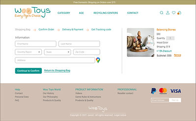
High-Fidelity Desktop Prototype
In the final stage, we developed a high-fidelity prototype to closely represent the final design and interactions of the WooToys website. This prototype includes refined visuals, typography, and interactive elements to simulate the real user experience. It was tested to ensure smooth navigation, intuitive user flows, and a cohesive design, making it ready for development handoff.


High-Fidelity Adoptive Prototype
The High-Fidelity Adaptive Prototype demonstrates the final design for various screen sizes, ensuring a seamless user experience across devices. It incorporates all visual elements, interactions, and responsive features, allowing the design to adapt fluidly to different device resolutions.


Key Results:
-
Understanding User Needs: Usability testing helped us pinpoint user pain points and refine the design to create a more intuitive and seamless experience. These insights allowed us to improve navigation, streamline interactions, and enhance overall usability.
-
Higher User Engagement: By prioritizing clear navigation and an accessible design, users could explore products effortlessly. This led to increased engagement, longer time spent on the site, and a noticeable drop in bounce rates.
-
Better Conversion Rates: Continuous testing and iterations helped us optimize the checkout process, making the user journey smoother. As a result, we saw a significant improvement in conversion rates.
-
Data-Driven Design Choices: Using A/B testing and heatmap analysis, we made informed design decisions to improve product visibility, simplify filtering, and enhance overall site usability—ultimately leading to higher user satisfaction.
Next Steps:
-
A/B Testing for Key Features: Test different layouts and features to determine which elements improve user engagement and shopping experience.
-
User Feedback: Collect feedback from users on the high-fidelity prototype to make final adjustments before development.
-
Social Media Campaign: Promote the new design on social media platforms like Instagram and Facebook to attract users and generate buzz.
-
Email Marketing: Send updates and special offers to interested users to keep them engaged and encourage return visits.
-
Development Collaboration: Work with the development team to ensure the design is accurately implemented and optimized for performance.